3.1 Visualising data
When you have data in your hand, it is often tempting to dive straight into plugging it into an analysis and seeing what the results are. However, in general this is unwise. The first step in working with quantitative data is to see what your data looks like. Looking at the data can give us a first glance into many aspects of the results, which can be informative for analyses.
3.1.1 Why visualise data?
“The greatest value of a picture is when it forces us to notice what we never expected to see.” -John W. Tukey
One of the first steps in working with quantitative data is data visualisation, which is the process of graphing it and looking at it. If you work with quantitative data then it should become standard practice for you to graph your data: specifically, after you’ve defined your research questions and methods of analysis, but before you actually analyse it.
It’s common for many students learning research methods and statistics to simply take a ‘cookie cutter’ approach - that is, collect data, run basic tests on it and call it a day. Sadly this is common even at our level, and you will almost certainly see this happen at music psychology conferences that you go to in future. People will present complex analyses that sound impressive - until you pick up on small cues that suggest they don’t really understand their data at all.
Below is an example of why data visualisation should be a crucial part of the quantitative research process:
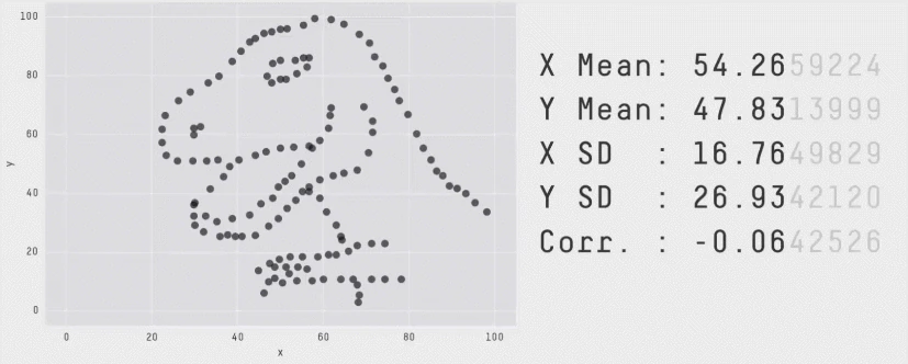
This series of datasets is called the Datasaurus Dozen, which are 12 datasets that look entirely different (including the dinosaur!) but share almost identical summary statistics, as shown by the bold numbers on the right.3
Data visualisation is important because:
- It lets you observe patterns in your data.
- It can reveal unexpected structures in your data that would normally be missed otherwise.
- It is an effective way of communicating information. The best graphs tell a reader everything they need to know in one image.
In the Canvas version of this subject, there are some general guidelines as to how to make good figures right around this point. For this version of the book, the section on ggplot is going to be infinitely better.
Regardless of which graph you use, every good graph should have the basic following features:
Content made with H5P.
There is actually an R package of the Datasaurus Dozen that you can play with: https://cran.r-project.org/web/packages/datasauRus/vignettes/Datasaurus.html↩︎