8.1 Correlations
We’ve talked a surprising amount about correlations in this subject, but we haven’t considered how to actually test if two things are correlated to begin with. We change that this week with an overview of correlation coefficients.
8.1.1 Covariance
To start, examine the figure below. The figure below plots the gestational period lengths of ~1230 pregnancies, plotted against the birth weight of the child.
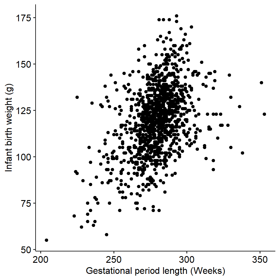 A trend might be immediately obvious - longer gestational periods are associated with higher birth weights. We can say that the two variables - gestation length and birth weight - covary with each other, as a change in one variable is associated with change in another.
Covariance simply describes and quantifies how two variables change with each other. For instance, if two variables have a positive covariance, this means that as one variable increases, so does the other. Similarly, if two variables have a negative covariance, this means that as one increases the other decreases.
How is covariance calculated?
The formula for the covariance between two variables X and Y is given as:
\[ \Large q = \frac{\Sigma (x_i - \bar{x})(y_i - \bar{y})}{N-1} \]
Where \(x_i\) and \(y_i\) refer to the individual values for variables X and Y respectively, and \(\bar{x}\) and \(\bar{y}\) refer to the means of variables X and Y respectively. Put simply:
- Subtract each participant’s value for variable X from the mean of variable X.
- Do the same for each participant on variable Y - their individual value minus the mean of Y.
- For each participant, multiply the two differences together.
- Sum this value across all participants.
- Divide by N - 1.
8.1.2 Correlation coefficients
We can quantify the strength of two variables using a correlation coefficient, which gives us a measure of how tightly these two variables are related. There are many types of correlation coefficients, but the most common is the Pearson’s correlation coefficient, r. It’s calculated using the below (simplified) formula:
\[ r = \frac{Cov_{xy}}{SD_x \times SD_y} \]
In this subject we won’t expect you to calculate a correlation coefficient by hand, but the key takeaway here is that by dividing a value by a standard deviation (or, in this case, a product of two SDs), we are standardising the covariance. Hence, a correlation coefficient is a standardised measure, meaning that we can compare correlation coefficients quite easily across variables regardless of their scale.
Correlation coefficients have the following properties:
- They are between -1 and +1
- The sign of the correlation describes the direction - a positive value represents a positive correlation
- The numerical value describes the magnitude
- A correlation of 1 means a perfect correlation; a correlation of 0 means a negative correlation
- A rough guideline for this subject, r = .20 is weak, r = .50 is moderate, r = .70 is strong
- Visually, a magnitude of 0 corresponds to a flat line; the steeper the line, the higher the magnitude
8.1.3 Activity
See if you can describe what the covariances would be like below:

Look at the below correlation coefficients.
| Is it positive or negative? | How strong is it? | |
|---|---|---|
| 0.35 | ||
| -0.24 | ||
| -0.02 | ||
| 0.85 |
8.1.4 Testing correlations in R
Statistical programs like Jamovi and R will allow us to not only quantify a correlation between two variables, but test whether this correlation is significant. Generally, when working with continuous data it never hurts to run a basic correlation.
Here is an example using a simple dataset containing the gender, height and speed (the fastest they had ever driven).
## New names:
## Rows: 1325 Columns: 4
## ── Column specification
## ─────────────────────────────────── Delimiter: "," chr
## (1): gender dbl (3): ...1, speed, height
## ℹ Use `spec()` to retrieve the full column specification
## for this data. ℹ Specify the column types or set
## `show_col_types = FALSE` to quiet this message.
## • `` -> `...1`
Let’s correlate height and speed. This can easily be done in R by using the cor.test() function. You simply need to give it the names of the two columns you want to correlate. By default, this function will run a Pearson’s correlation.
##
##  Pearson's product-moment correlation
##
## data:  w10_speed$height and w10_speed$speed
## t = 9.2871, df = 1300, p-value < 2.2e-16
## alternative hypothesis: true correlation is not equal to 0
## 95 percent confidence interval:
##  0.1977889 0.2997013
## sample estimates:
##       cor
## 0.2494356
We can see that our correlation is r = .249, which is a relatively weak to moderate correlation. This correlation is also significant (p < .001). We also get a confidence interval around the size of the correlation, which is great for showing the range of possible values. So we might write this up as something like:
There was a significant weak positive correlation between students’ heights and their fastest ever driving speed (r(1300) = .25, p < .001; 95% CI [.20, .30]).
8.1.5 Displaying correlations
It is common to compute correlation coefficients between multiple variables at the same time and display them. In more complex analyses, this is often a crucial early step in the analytical process. Below are two ways of visualising multiple correlations, using fictional questionnaire data.
The first is simply a correlation matrix, like below:
| Q1 | Q2 | Q3 | Q4 | |
|---|---|---|---|---|
| Q1 | 1.00 | 0.24 | -0.56 | 0.72 |
| Q2 | 0.24 | 1.00 | -0.38 | 0.43 |
| Q3 | -0.56 | -0.38 | 1.00 | -0.11 |
| Q4 | 0.72 | 0.43 | -0.11 | 1.00 |
The second is a correlation heatmap, which is especially effective with many correlations at once (common when working with huge questionnaires or neuroimaging). As shown by the legend on the right, the colour and shade of each square are determined by the strength of the correlation. This can be easily done by the `ggcorrplot package, if you have a correlation matrix formatted in R: