2.7 Making graphs with ggplot2
2.7.1 Building the plot
ggplot2 (henceforth referred to as ggplot) is the tidyverse package for plotting and visualising data. It is an immensely powerful and flexible way of graphing data in R, and is basically the de facto means of creating visualisations for R users.2
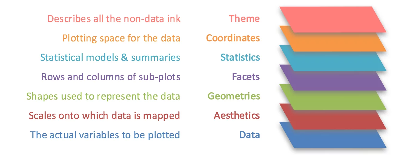
The ‘gg’ in the name ggplot stands for grammar of graphics. The idea is that a graph is built by layering different components of a graph (the graphics) in a structured way (the grammar). The idea was first put forward by Leland Wilkinson, and looks something like this:
A cheatsheet for ggplot can be found here.
To start a plot, we first call the ggplot() function. Here, we specify three of the main features of our plot - the dataset that we want to use, the x axis and the y axis. the x and y axes are wrapped within the aes() function, which defines our aesthetics. Here, we simply say which columns of our dataset should go on the x and y axes. Using the penguins dataset, we can start to visualise a scatter plot between bill length and bill depth like this:
However, notice that the plot is empty. This is because we’ve only specified the first two layers of our graph: the data and the aesthetics. We haven’t defined any geoms, or actual plotting methods, in our plot.
2.7.2 Geoms
Geoms (short for geometries) define how data is plotted. If ggplot() provides the basic canvas for the graph (i.e. what to plot), geoms are what create the graph (i.e. how it is plotted). Different graph types are defined using geoms. As per the diagram of the grammar of graphics above, we add (literally, using +) additional layers to our base ggplot() call in order to build our graph.
Refer to the cheatsheet for all of the possible geoms. For now, we will stick to some basics.
A scatter plot can be specified by adding geom_point(). This requires that your x and y variables are continuous:
geom_smooth() will add a line of best fit to a scatterplot. You can add this as another geom layer by adding geom_smooth(method = "lm"). Specifying the method is important because by default, geom_smooth() will probably fit LOESS curves (local polynomial regressions). Note that this function should be added after using geom_point().
By default, the line will also have standard error bands around it. You can turn this off by also specifying se = FALSE in the geom_smooth() call.
ggplot(data = penguins, aes(x = bill_length_mm, y = bill_depth_mm)) +
geom_point() +
geom_smooth(method = "lm", se = FALSE)## `geom_smooth()` using formula = 'y ~ x'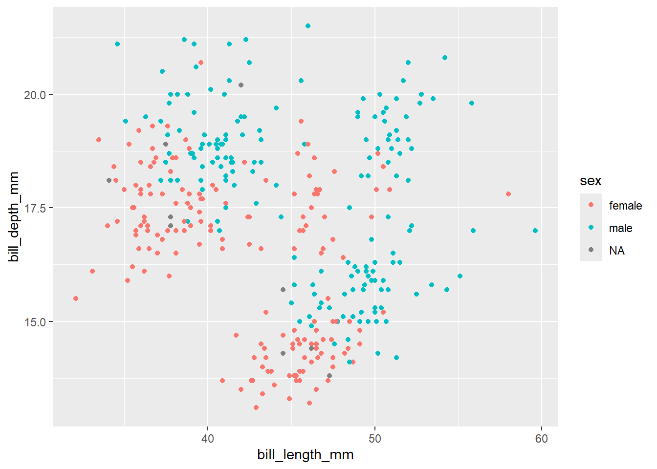
geom_boxplot() will create boxplots. For this geom to work, a categorical variable must be on the x axis and a continuous variable must be on the y axis. An example is below, with species on the x axis and body mass on the y:
geom_violin() plots violin plots, which is a variant of the boxplot that also plots the distribution.

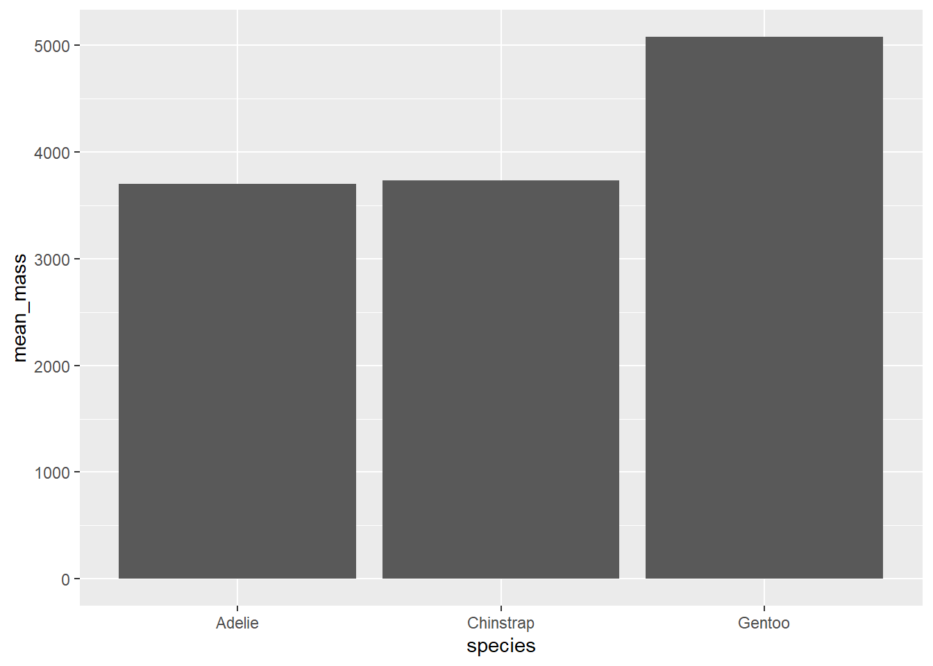
geom_bar() and geom_col() will both create bar plots, but their usage is slightly different. geom_bar() is best used if you want to plot the number of items in each category. geom_col() is best used to plot means or similar statistics.
penguins %>%
  group_by(species) %>%
  summarise(
    mean_mass = mean(body_mass_g, na.rm = TRUE)
  ) %>%
  ggplot(aes(x = species, y = mean_mass)) +
  geom_col()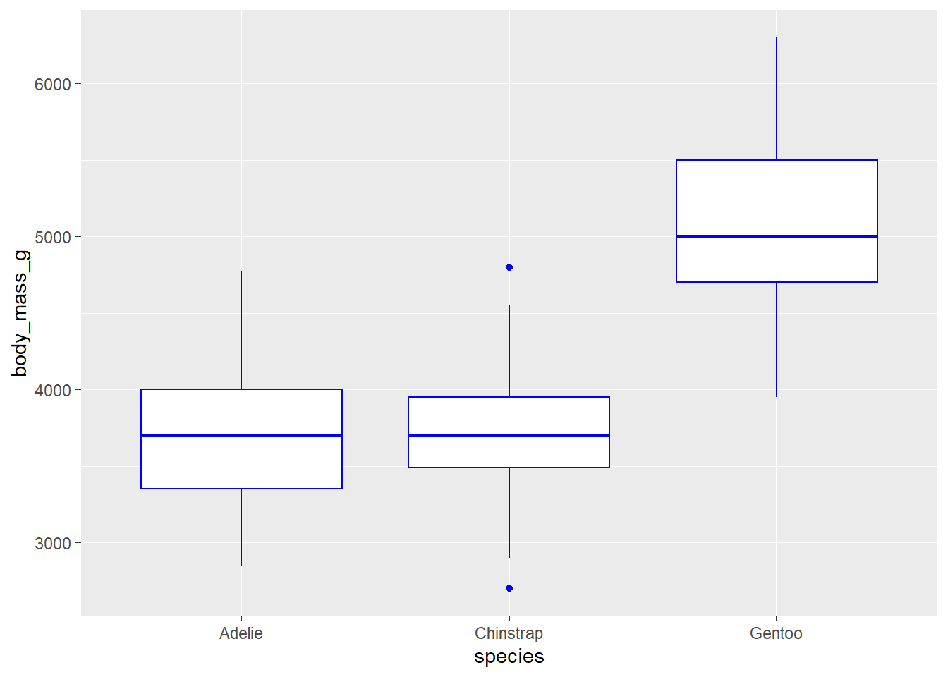
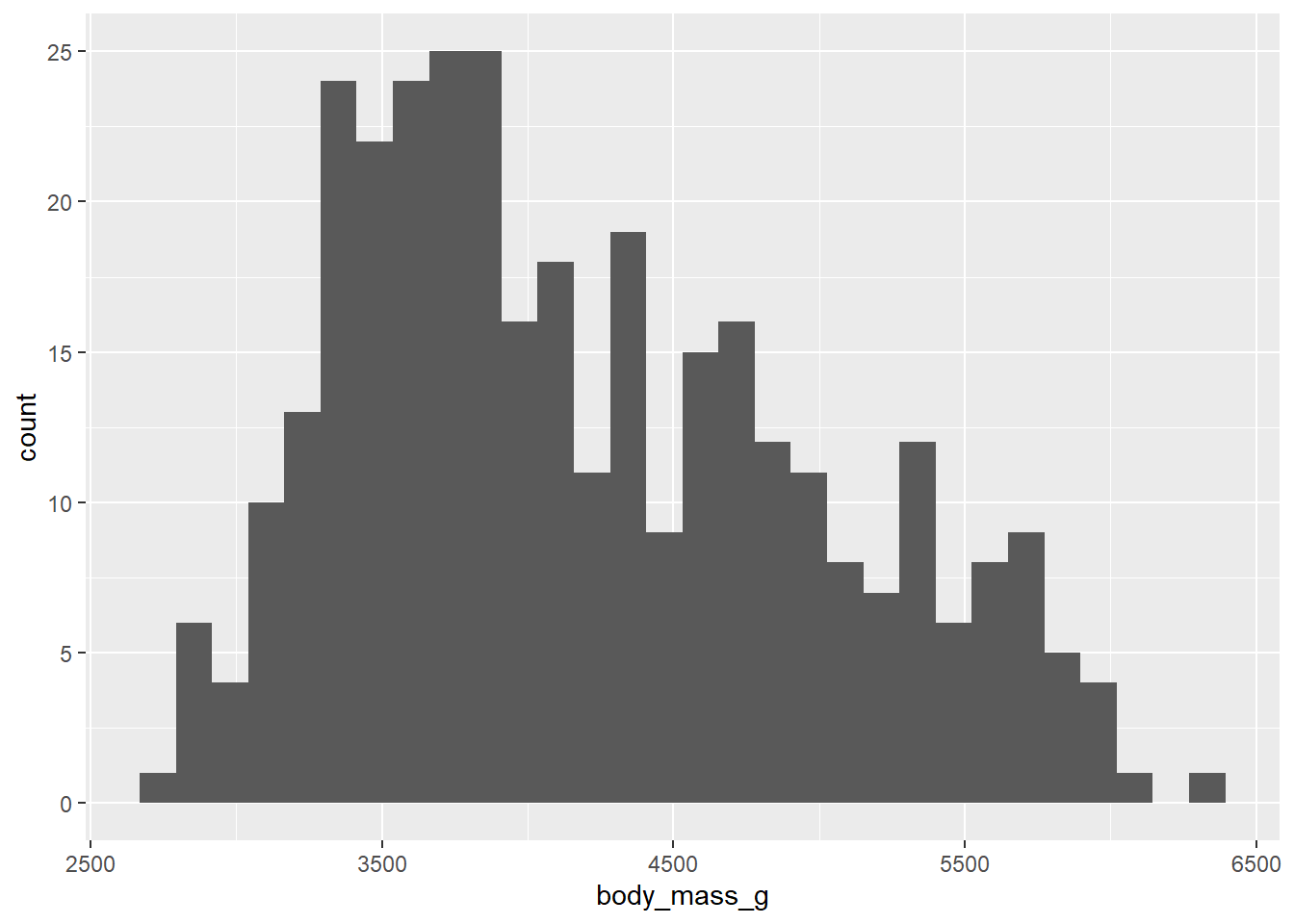
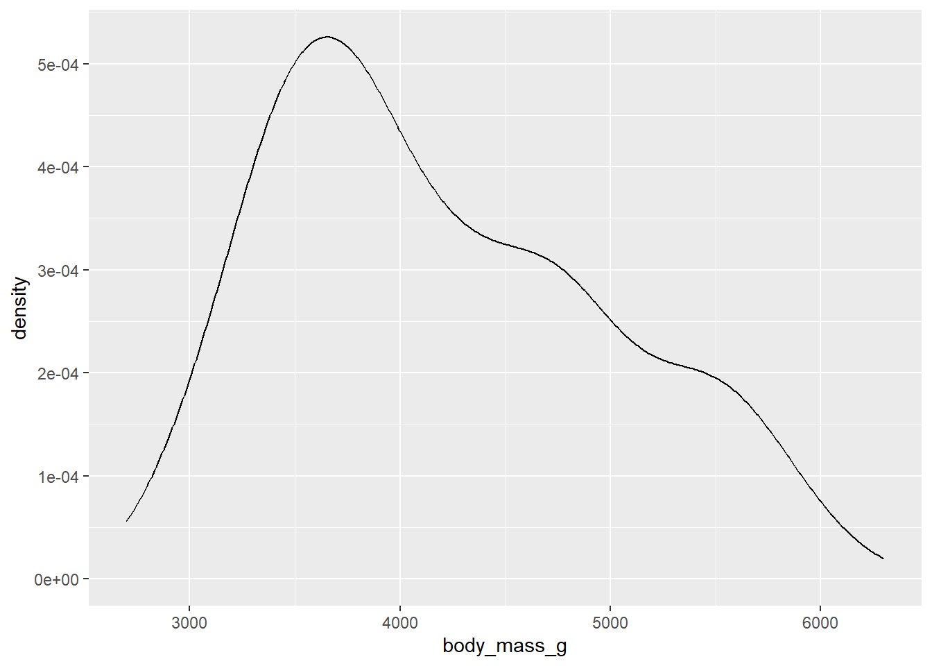
geom_histogram() will plot a histogram, which is useful for visualising distributions. For this, you only need to provide one continuous variable on the x-axis. geom_density() will plot the same information but using a smoothed line instead of bins.

2.7.3 Making the graph look better
This is all well and good, and we already have workable basic graphs using ggplot. From here, we can change many things by adding or modifying our existing layers to our ggplot. There are so many options available here, but here we’ll only focus on some basic considerations.
An important aspect of data visualisation is a good use of colour. Colours should be used in both an informative and an aesthetically appealing way. A particularly common but effective use of colour is to use different colours to denote different groups in a plot.
ggplot provides two mechanisms within aesthetics for controlling colour. Both must typically be included in the aes() part of ggplot().
colourcontrols the colouring of points and lines. For graphs with shapes, such as boxplots and violin plots, this argument will control the colour of the border.fillcontrols the colouring of anything over an area, such as bar plots, histograms and density/violin plots.
We can tell gggplot to colour in aspects of our graph based on another variable in the dataset we are using. For example, if we want to colour a scatterplot between two vraiables by sex (which is a column in the penguins data), we can do so by specifiyng colour = sex in our aes() function.

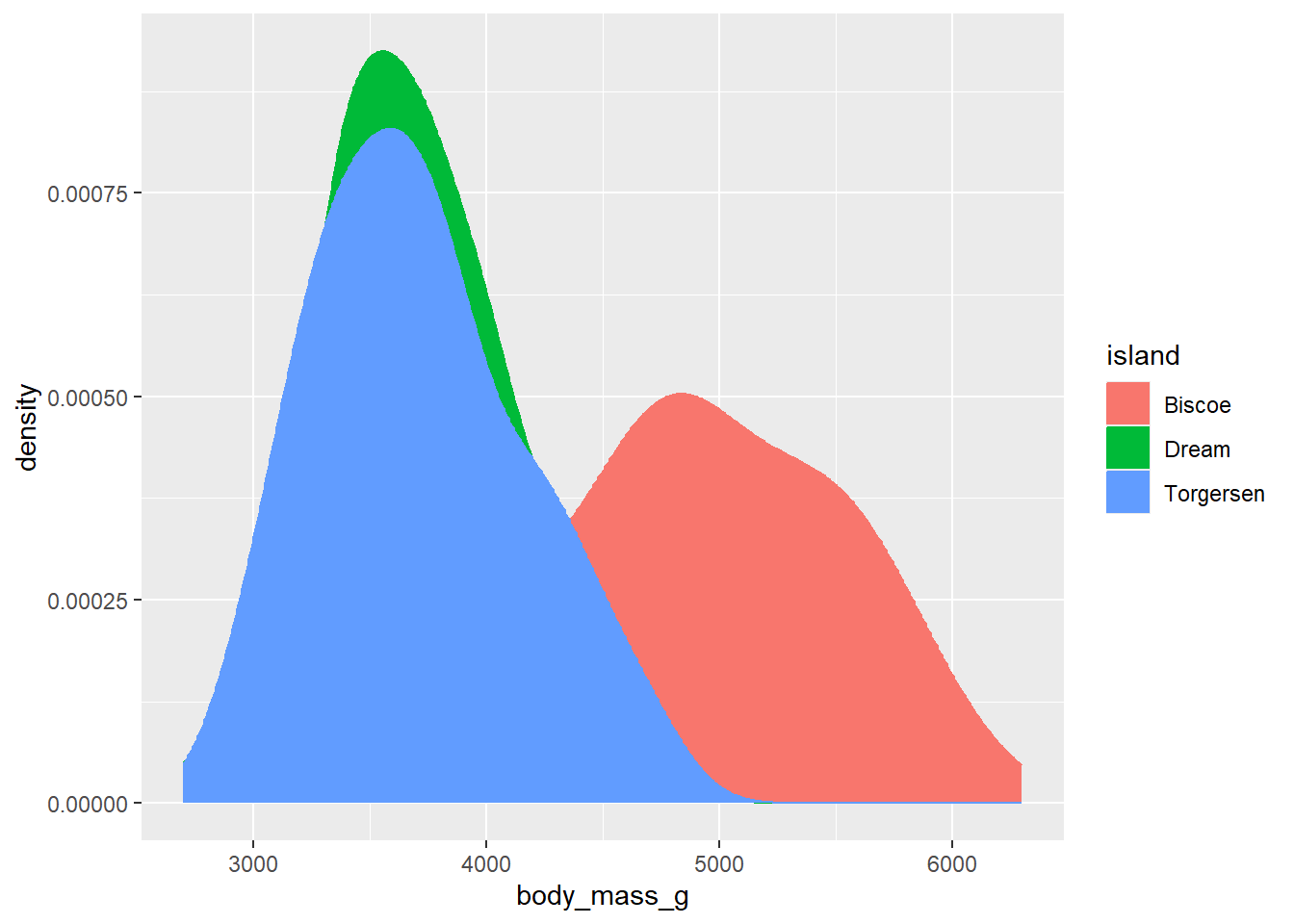
Many graphs allow for control of both colour and fill. In these instances, as noted above, fill controls the colour within the shape while colour controls the colour of the shape’s edges. For example, here is a density plot that specifies both colour and fill to be controlled by the variable island. This has the effect of making both the borders and the area within the shape the same colour.

Now, this is all well and good but in this particular instance the overlapping of curves means that we can’t actually see what is going on very well. The data points from Torgersen island, for instance, almost completely overlap with the data points from Dream Island. One way to get past this is to specify another aesthetic called alpha, which sets the transparency of the fill.
As we typically only want to change the transparency of one type of geom in a plot, the best place to include an alpha argument is within the geom call itself (in this case, within geom_density()). alpha can range from 0 - 1, where 1 means an object is 100% opaque (i.e. 0% transparent) and 0 means 0% opaqueness (100% transparency). Here, we use alpha = 0.5 to set the fill to be 50% transparent:
ggplot(data = penguins, aes(x = body_mass_g, fill = island, colour = island)) +
geom_density(alpha = 0.5)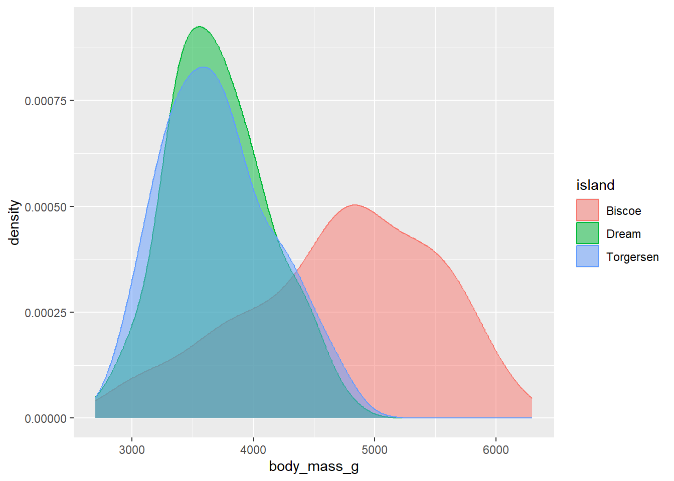 Now we can see the outlines of each density curve more clearly! This is great.
ggplot also supports the manual specification of colours. R by default comes with a bunch of strings that are recognised as colours during graphing, such as "black", "blue" and "red". These can be used to manually set either the colour or the fill of a geom. To use these, you can instead use colour/fill within the geom like so:

You can also provide hexadecimal strings (e.g. “white” corresponds to "#FFFFFF"). See the Appendix for a full list of the basic palettes in R.
Every graph needs good axis titles. By default, ggplot will use variable names as axis labels, which often aren’t very informative by default. We can change this by adding labs(), which is a simple way of specifying x and y labels:
ggplot(data = penguins, aes(x = bill_length_mm, y = bill_depth_mm)) +
geom_point() +
labs(x = "Bill length (mm)", y = "Bill depth (mm)") 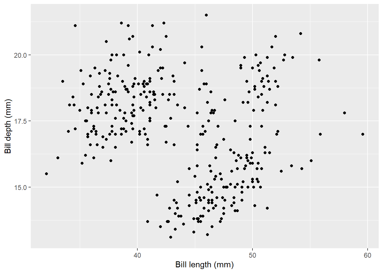
Finally, if you want to split plots by a certain variable, add facet_wrap() to your call. You need to specify what variable/column you want to split by, with a tilde in front. For example, if we wanted to split the scatter plot by year:
ggplot(data = penguins, aes(x = bill_length_mm, y = bill_depth_mm, colour = sex)) + geom_point() +
labs(x = "Bill length (mm)", y = "Bill depth (mm)") +
facet_wrap(~year)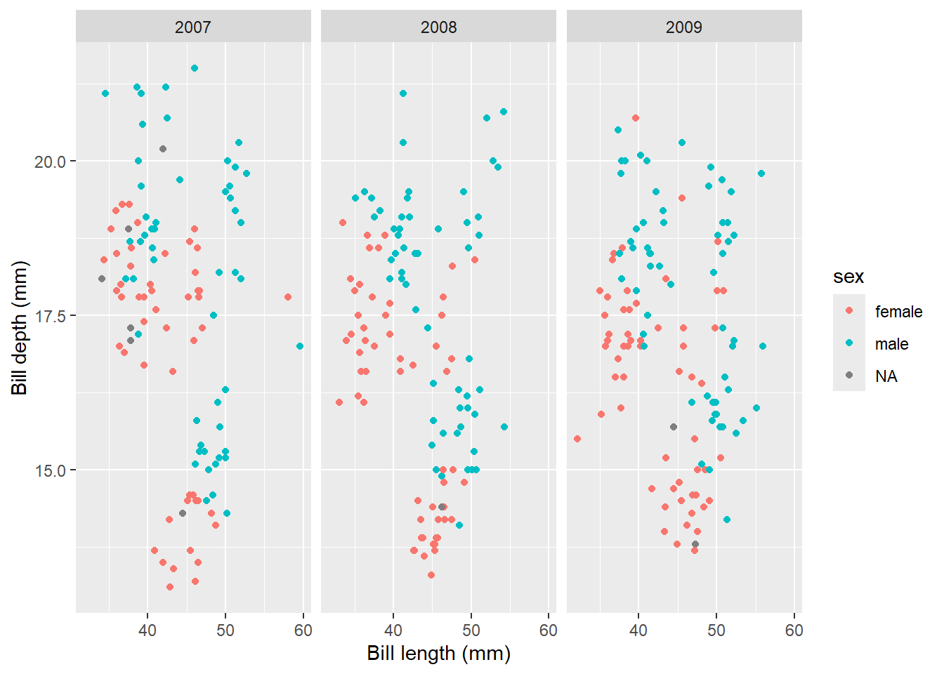
You can see that the graph now creates one graph per year, which can be immensely useful for visualising data points between groups.
From here, there are so many things you can do with ggplot - and it helps to get creative!
Almost all of the graphs in RPMP (in fact, I think it actually is 100%) were made using
ggplot2.↩︎